Your pocket lab.
YEAR
2022
TYPE
Undergrad Capstone Project (Live)
DELIVERABLES
Brand Identity
UX Design (App and Website)
UI Design (App and Website)
Packaging Design
DURATION
6 Months
This project is now live!

Mellow Designs is a branding and UI/UX studio based in Bangalore. I was given the opportunity to work and lead one of their client projects. It was a work-from-home opportunity and a fulfilling experience.
I was mentored by Rohit Dhongade, the Creative Director of Mellow Designs. I was the project lead and designer for Spark, where I designed the visual identity as well as the UX & UI for the app and website.
I ended up scoring a full 10 SGPA with this project for my final semester, and I would like to express my gratitude to Mellow Designs for giving me this wonderful opportunity to spearhead such a long engagement.
Working with Mellow Designs-
A little background
Spark Mobile Diagnostics is a client based in the health and diagnostics sector. They provide multiple types of portable test kits which give instant results through their app.
These test kits are an actual physical product which the user can order online. They can then test themselves at the comfort of their home & get the results online on the Spark app. The app also has a doctor side flow which allows doctors to analyse the reports and prescribe medicines to their patients.
Spoiler Alert! Since the project is now live, the video showcases the final product. Scroll to continue with the case study!
Video Credits: Mellow Designs
About Spark
Scroll for the summarised case study
The Problem
The task was to create a fresh brand identity for spark diagnostics, to design the app, website, and packaging, along the lines of the newfound visual language.
Problems from branding/visual perspective
Problems with the User Experience
-
Outdated design with excessive details
-
Lack of a cohesive color palette
-
Tacky content presentation
-
Inconsistent visual style
-
Poor visibility in banners
-
Separate apps for each product
-
Scattered information architecture
-
No interactive elements
-
No use case for doctors
-
Lacks a cohesive brand experience across products

Spark before the revamp
The Process
Conducted Research about the current competitors in this industry. Created user personas to identify and better understand the types of users for these products and the problems that they faced. Researched suitable brand archetypes.
Most of this was done by Mayukhini Pande (UX Researcher).
Defined the problem statement, target audience and conducted competitive analysis. Decided on the overall communication tone for the brand, the brand archetype to follow, and the style of the overall visual language based on the competitor study.
Developed a unique brand identity for Spark. Further expanded the visual language for all of the required collaterals, including, the app, the website and their product packaging.
Created the complete system for Spark, showcasing the use of its portable test kits, the user experience for the app & website - based on the decided visual language.
The final delivery wasn't just linear, but involved app testing and refinements based on client feedback.


It wasn't exactly linear!
Client feedback on visual language led to redefinition of brand archetype
Consolidating doctor and patient platforms into a single app based on testing insights.


Meet the Personas
Here are a few personas that were created based on the research done regarding the target audience. This is just a summary of all of them. These were done just before my onboarding on this project, and they helped me drive it further.
1. The Chronicler, Age: 55
“Checking my Ph balance every morning helps keep me on track to a healthy alkaline diet--an important step for combating osteoporosis without succumbing to Big Pharma’s pills.”
Goal: Maintain health via alkaline diet to prevent osteoporosis.
Challenge: Overwhelmed by complex health data; prefers simple, actionable insights.
2. Once Burnt, Age: 45
“I had a severe Vitamin D deficiency which cause high blood pressure. It costs me over $200.00 to have my vitamin D checked at the Doctors office. I need to check twice a year and this saves me a lot of money and is easy to use.”
Goal: Reduce doctor visits by tracking Vitamin D levels.
Challenge: Needs easy-to-use app with reminders for consistent health tracking.
3. Hip Dieters, Age: 35
"The app offers valuable insights from my urine, which is especially interesting for tracking my intermittent fasting progress before breakfast."
Goal: Use health data to optimize diet and intermittent fasting.
Challenge: Requires real-time, detailed data integrated into fitness routines.
4. Reverse Parenter, Age: 50
"My elderly mother has trouble staying hydrated, so this is a godsend for us to be able to catch the dehydration before it causes additional problems. Hopefully we will be able to keep her Dr visits to a minimum."
Goal: Keep elderly mother hydrated to avoid health complications.
Challenge: Needs easy health tracking without overwhelming notifications.
5. Savy oldies, Age: 68
"We use it at least once a month or more often if we feel like we have a uti we are in our late 60s and we have people we know who have died from UTIs because of sepsis."
Goal: Proactively manage health to prevent UTIs and infections.
Challenge: Prefers clear, simple health insights without data overload.
6. Pet Parent, Age: 40
“Bought these after my 4 yr old collie/shepard mix had surgery to remove a bladder stone. Now I check her urine ph at least 2x's a week.”
Goal: Monitor dog’s recovery post-surgery and prevent future issues.
Challenge: Balances pet care with a busy schedule; needs reminders.
Competitive Analysis
The brands shown here are some of the competitors for spark in this field. To understand what separates each of them, we gathered references about their visual languages, product showcases, communication tones.

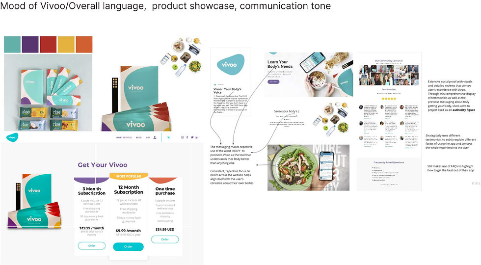


A glimpse of the brand moodboards we studied, looking at their positioning, UI styles, UX, etc.
The Final Product!
Here’s how the final project unfolded! Since this is a summarized case study, I’ve significantly shortened the content. If you’d like to view the full case study that I presented for my final year's capstone jury, feel free to click this link.
Now, let’s dive into the final product! I've included the branding, packaging, website & the app design.
Nailing the Identity-
The Final Logo
What is the one common factor between all the tests that Spark provides?
All tests are liquid-based.

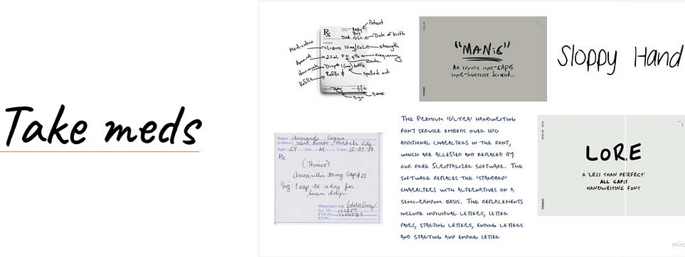
And is it really a prescription without the doctor's handwriting? We decided to capture that essence with a handwritten font to pair with our sans serif choice (of course, we still kept it readable).

The Packaging
I designed the packaging, to mark the expansion of the visual language that I had created. The idea was to colour code each test/product to make it easily identifiable for a user when buying it from the store shelf.
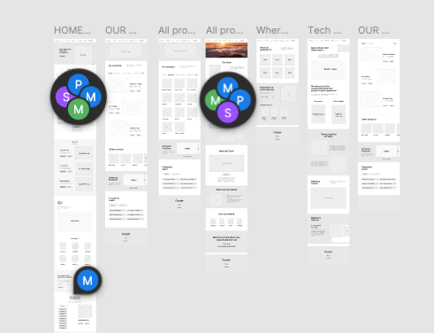
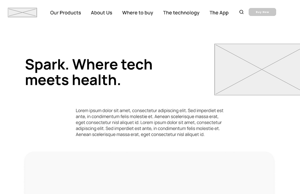
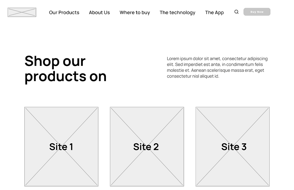
I created the complete framework for the website in the form of low fidelity wireframes.
Designing the UI for the Website




Designing the App
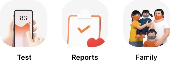
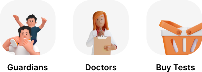

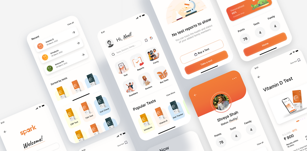
Expanding upon the style we set for the brand, we decided to use 3D iconography. It brought a sense of fun to the overall UI, making it more approachable at the same time.
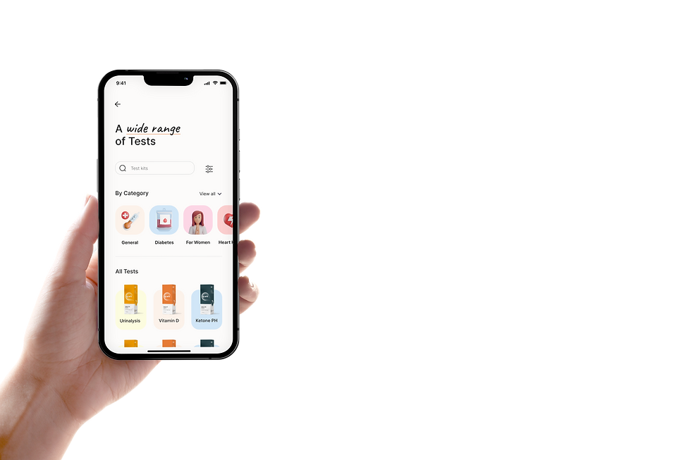
I categorised all the tests and grouped them according to the purpose they serve. This makes it easier for a layman to quickly pinpoint towards a test that he/she needs to take for his/her problem.
Some key screens (out of the total 283!)




Doctor/Personal
The onboarding screens are a gateway for the user to select their purpose of use which takes them to their respective set of screens.
Pages for the Tests
The individual test pages have been designed to keep the process simple. There will be a walkthrough video at the top on how to use the respective test kit.
Kit Glossary
One of the pain-points that I discovered after using the products myself was that there was a lot of equipment in the kits that I couldn't make sense of. This Kit Glossary screen serves the purpose of making sure the user understands all the equipment provided in the kit.
Get Instant Results
Get lab-grade results in just a few minutes! All the tests show results right after the user completes the step-by-step instructions. They can share these directly with their doctors from here.
Manage Your Test Reports
View all of your previous tests at once and keep a track of your progress.
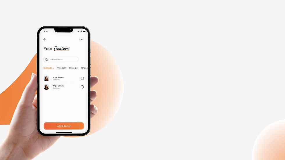
Keep Your Doctors & Guardians in Loop
You can share your results with your doctors and your guardians.
Doctors can analyse your reports and provide you with prescriptions.
Guardians can remind you to take your tests on time and monitor the results.
Monitor your family members
A feature especially useful for the forgetful ones! You as their guardian, can remind them to take their tests on time and also keep a track of their test reports.
The Doctor Dashboard
The homepage for a doctor's or a healthcare personnel's login. They can prescribe Spark tests to their patients. They can also guide their patients through the steps and the results get sent to the patients once the test is done.
Guided Scanning
Scan the test strips and cassettes with ease as Spark provides directions to position the camera.
Report Graphs
Easily navigate through reports to find the results of the tests that were taken months ago.
Hey, you're still here! This was an extensive project spanning 6 months, and I've tried my best to summarize it in this concise case study (you can never put enough stuff).
Click this link to see the complete case study that I presented to my Undergrad Capstone Jury.
Meanwhile, here's the final brand as a whole.
And finally, here's the brand as a whole!


